
Table of Contents
Over the past two years I’ve dedicated part of my career to building a conversion rate optimization (CRO) team from the ground up. During this time, we ran over 300 tests on over 20 different client and internal websites with traffic ranging from 1,000 to 1.5 million sessions a month. We hit some home runs, made plenty of mistakes, and learned a TON along the way.
In hopes of saving you a few headaches, I’ve curated a list of some of the most important lessons learned. Enjoy!
(Related: Here’s a conversion rate optimization case study on one of the websites we tested on.)
Focus on One Metric
In order to maintain a focused CRO strategy, you need to know what the most important metric is and make that your team’s priority. When we first started, there was a long list of metrics that we wanted to improve on; this resulted in an unchoreographed effort to test and improve everything. This approach didn’t get us good results.
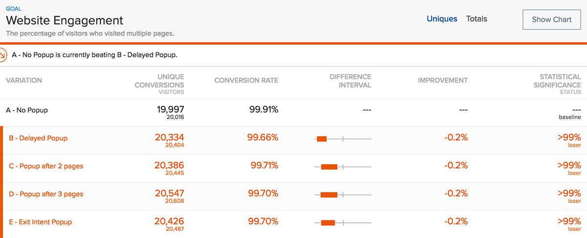
In order to focus our efforts and run effective tests, we were able to shorten our list to one metric: the amount of visitors that converted into a lead. We set up every test with that metric in mind. This helped us to avoid running expensive tests focused on vanity metrics. For example, we turned our focus away from increasing page visits (website engagement) to improving the user journey towards gated content (lead generation).
Okay But Don’t Just Focus on One Metric…
Hear me out. Yes, you need one main metric to be your team’s priority. But that primary metric has supporting metrics that determine how well it will perform.
At an individual test level, you need to make sure you’re keeping an eye on other metrics that determine the success of your main metric or that affect a different and important part of the business/website. Even if you don’t believe they’re directly correlated (they probably are).
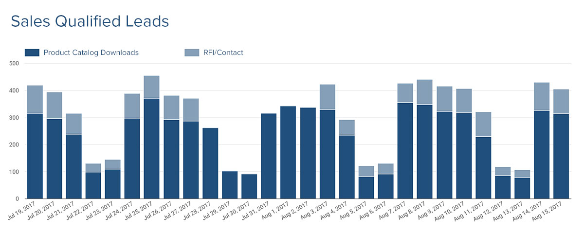
Early in my testing career, I ran a test where I was able to increase RFI submissions by 6%. From my perspective, that was a pretty solid result that should have improved the company’s bottom line. However, a month later the client came back to tell us that it was the lowest sales month they’ve had in a few years. I then realized that the same test that increased RFIs decreased product catalog downloads — the main source of lead generation for their sales team — by 24%.
Ever since that debacle, I’ve made sure to include the website’s vital metrics as goals for any test I setup. While you may think you’re scoring big wins, you may be affecting other vital metrics in a not so awesome way. I suggest you keep an eye out for this, especially when running tests to leading metrics.
Let Friction Points & Your Main Metric Determine What You’re Testing
You need a game plan. Instead of choosing random things to test, start by identifying the friction points of the website you believe will have the biggest impact on your main metric.
Get cozy with Google Analytics. Set up goals that will help you keep track of all the important actions someone could take on your website (landing page views, form submissions, etc) as well as all the bad stuff that could happen (404 page views, form error messages, etc).
Once these goals are in place, set up individual segments of users that triggered the respective goals and analyze the hell out of it. You can compare segments of users that triggered a bad goal vs all users and see how these convert on the good goals. (I hope I didn’t lose you — this guide does a way better job of explaining this than I did.)
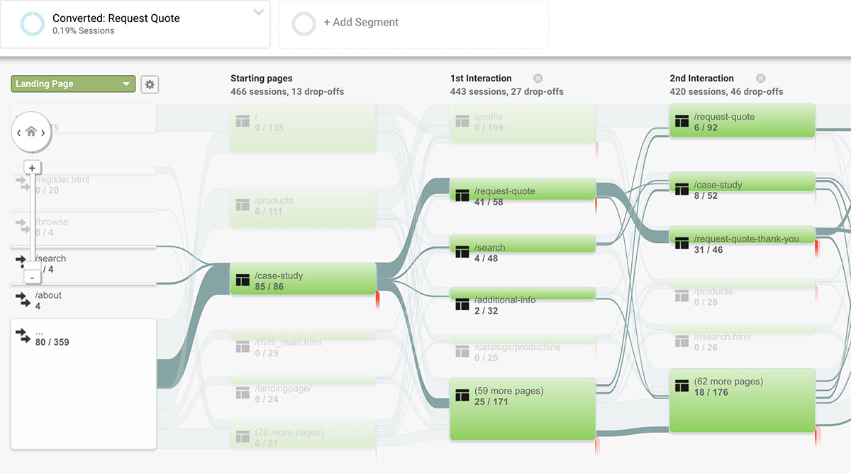
Play around with Google Analytics’ Behavior Flow tool. Set up a segment of your audience that has triggered your primary goal and see the path that was taken to get there. Look for pages with huge drop-offs and investigate.
You can also use a user recording tool like FullStory that let’s you see which user sessions have a high rate of rage, error, and dead clicks.
Whichever the method you may use, focusing on user frustration will help you address low hanging fruit first and give you a clear path of what you should be focusing on.
Focus On a Minimum Viable Vision with Minimum Viable Tests
A test that takes a minimum amount of time to implement that produces a huge increase in conversions is the nirvana for any CRO team. This is usually not the case, but it should always be the mindset. This helps with testing velocity and quickly proving/disproving hypotheses without the expensive overhead.
Test the minimum version of your idea instead and build from there. Design isn’t magic and because an idea worked for one website doesn’t mean it’ll work for yours. Which brings me to my next point…
It’s Difficult to Reproduce Results
Just because you achieved statistical significance on a certain test doesn’t mean that it’s a pattern that will work everywhere. My team ran a test that increased conversion rates on a landing page by 76% — only to have the same test decrease conversions for a different client and test inconclusive for another.
There are a handful of different variables, some obvious and some not, that are present with every test and have a big impact on the outcome (audience, traffic source, content, goals, etc); the goal with an A/B test is to change one of these variables with hopes of producing positive results.
What most people don’t take into consideration is the relationship between these elements and how they indirectly affect each other. In the example above, we came to the conclusion that forms with a clear headline had a better chance of improving conversions than those that don’t — but the answer is usually not as straightforward.
The folks over at GoodUI.org focus most of their energy on figuring out which are the winning tests that you can easily reproduce.
Good Aesthetics & Solid Design Principles Don’t Always Win
We recently had a debate on a hero image test. The solution proposed by my team was one that I wasn’t in line with. Not only were they going against the basic graphic design principle of balance, they were also doing it in a distasteful way (in my opinion).
(I would show you the variations of the website but I’m going to respect the client’s NDA.)
I was 100% sure that my experience and background in design would prove my theory. The test had a 66% increase on leads generated just by switching that darn image. I swallowed my pride and learned to put my opinion aside.
Failing Tests Are Still Wins
Not all tests you run are going to be home runs, the reality is that a handful of your tests will fail. Don’t let this turn into time wasted, analyze the hell out of the test, understand why it failed, and store it for reference. You will be referencing this in the future.
If none of your tests are failing, chances are only a few of them (if any) are home runs. Stop being so risk-averse.
(Keep in mind that I’m referring to failed tests due to uncertainty and not mistakes. This is the difference between low conversions on a form due to the specific form fields used — uncertainty — and zero conversions on a form due to a broken submit button — mistakes.)
The Secret Sauce is a Strong Hypothesis
This helps to make sure there’s merit to what’s being tested. The hypothesis should dictate what you test and not the other way around — you shouldn’t find yourself struggling to come up with a hypothesis last minute before launching a test.
Make it a habit to create a hypothesis when making any type of UX decisions on a website, regardless of whether you’re A/B testing or not. (Example: If we keep the load time below three seconds, users will have a higher probability of sticking around due to the load time tolerance of the average user.)
A Good User Experience = Long Term Sustainability
User experience is at the heart of everything we do, and it’s not something that should be sacrificed to generate more leads. I’ve come across websites that completely destroy their user experience in order to generate a handful of more leads. Although this may produce more leads in the short term, bad UX leaves a bad impression on the user, which ends up producing long term brand damage and sacrificing usage/visits on your website. Not what you want.
A/B testing is a very strong tactic, but it should only be one of the many in your toolbelt of user research and testing. Make the experience for your users an invisible one. Figure out user-friendly alternatives for some of those more aggressive tactics.
Some Tools & Resources
- Optimizely - Preferred A/B testing platform (I’ve tried most)
- FullStory - Really awesome user recording tool
- HotJar - All in one tool for heatmaps, user recordings, surveys, funnels, and more
- GoodUI.org - Great resource for testing ideas
- ConversionXL Blog - In depth CRO related articles (they also run a top-notch CRO conference)
- Call To Action - CRO focused podcast by Unbounce
- UIE.fm - A UX podcast network curated by the talented Jared Spool
- CRO/GDD Case Study - Article I wrote on one of the accounts I tested on
- Research-Driven Conversion Optimization - The data-driven conversion optimization guide by CXL
- Growth-Driven Design - An approach to building websites with CRO and continuous improvement as a foundation

I'm Julian, a product design leader and developer with a habit for experimenting (I did some cool stuff at Thomasnet.com). I mostly write about what I'm working on related to product design, front-end development, and experimentation.
While you're here, I'm currently in the market for a design leadership gig. If you're interested in working together, hit me up, or feel free to share my resume.
Notes From the Field

Designing Multi-Sided Platforms
A comprehensive guide on designing the experience and growing the engagement of networked markets.

A Pragmatic Approach to Design Principles
How we took our design culture from executive-centric to user-centric with the help of pragmatic design principles.

Server-Side Split Testing for Static Websites
When to use, when to avoid, and setting up your A/B testing stack.

How We Adopted CSS Grid at Scale
From team buy-in to fallbacks, here's the approach we took at Thomas with the implementation of CSS Grid.

Don't Fight The Notch — Designing for the iPhone X
Coming to terms with the notch on the iPhone X and its effect on mobile design.

Lessons Learned After Running 300 A/B Tests on 20 Different Websites
Over the past 2 years I’ve dedicated part of my career to building a conversion rate optimization (CRO) team from the ground up. Here's what I've learned.