
Table of Contents
Over the past year, we at Results-Powered Marketing (the agency I work for) have integrated Growth-Driven Design into our approach to building and maintaining websites. For those unfamiliar, GDD is an agile approach applied to the website development process — the goal is to get something out the door as soon as possible, test, iterate, and keep making tweaks to drive better and stronger results for our clients.
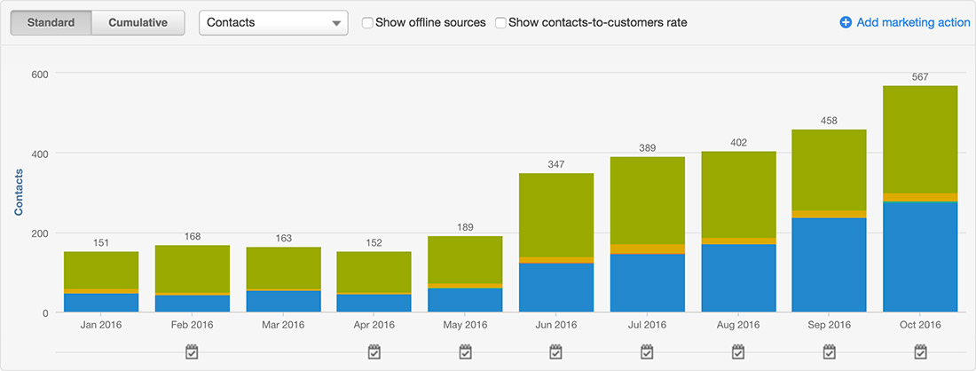
In this specific case study, we were able to increase our client’s new monthly leads generated by 278%.
Hy-Lok USA came to RPM three years ago to take advantage of the team’s marketing and industrial expertise to grow their marketing, lead generation, and subsequently, sales. In spring of 2015, our team launched a new website and saw a small bump in new leads generated.
A year later, Hy-Lok USA upgraded their service agreement with RPM to include GDD services. At the time, we only had four months of GDD experience under our belt, which was more than enough to see how powerful performance-based updates can be. Specifically, for this client, we saw an initial 128% increase in new leads generated month-over-month — in just eight weeks. Pretty cool, right?
Let’s talk about the testing and changes we made to get such stellar results.
Landing Pages
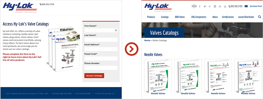
We started the engagement by targeting their landing pages; for those new to the party, in the inbound/content marketing world, a landing page is a page on the website which gates certain content (eBooks, catalogs, etc) behind a form field in return for the visitor’s information. The belief is that it’s a fair tradeoff for the content that you’re looking to download.
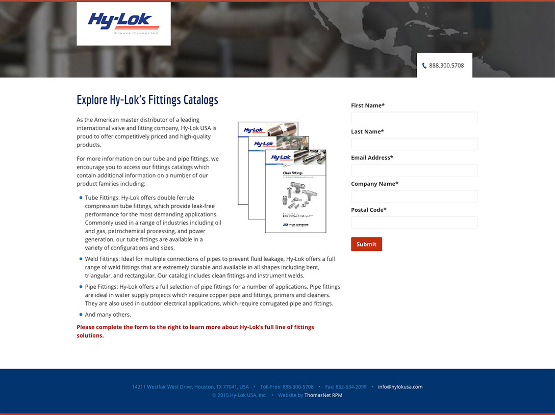
While we believed we had a good foundation for these pages, we wanted to test their two main landing pages with the following improvements:
- Removing header background image to create a unified design and avoid unnecessary visual distractions
- Removing links from the footer to keep the user focused on the content on the page
- Adding 3D cover of the offer (catalogs in this case) to create visual interest in what their prospects were there to download
- Adding a background to the form in order to increase the emphasis of the action we want the user to take (submitting their information)
Before
After
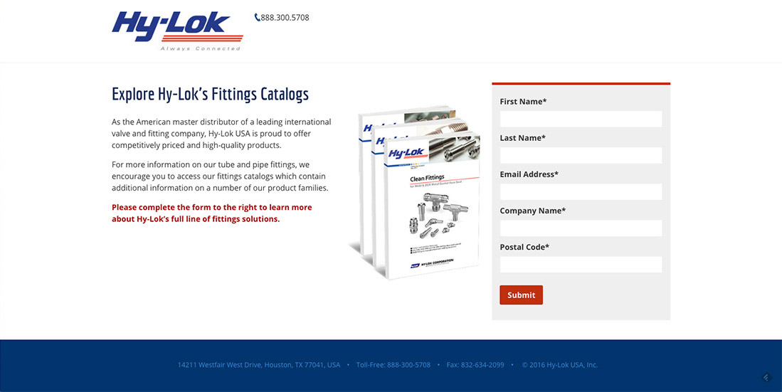
We saw a 6% increase in new leads generated from this improvement.
Footer CTAs with 3D eBook Covers
Next, we took a step back and targeted the exposure of the CTAs leading to the landing pages on the website. Our thought process was if we increased the traffic to the landing pages, the conversions would increase.
We setup a multivariate test and added the same and/or similar CTAs that were located at the top of any given page to the bottom of the page. Instead of adding them as CTAs, we added them as 3D eBook covers, which more closely represented what a prospect was downloading and hoped to catch their visual interest.
We saw a 104.8% increase in new leads generated with this improvement. Yes you read right — by reusing CTAs that were already on the page (for the most part) and visually presenting them in a different way and in a different location, we were able to double new leads generated. (That’s the big bump you see from May to June.)
Progressive Disclosure with Gated Content
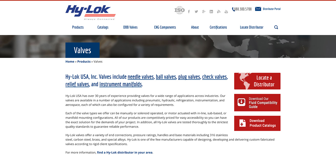
When we initially set up GDD, the company’s two sets of catalogs, fitting catalogs and valve catalogs, were gated differently.
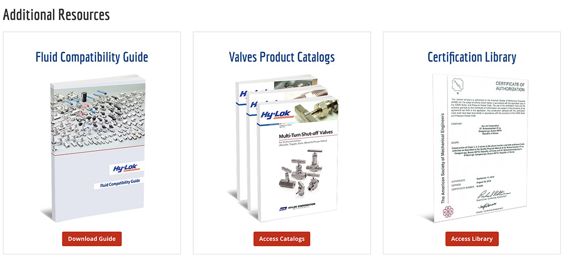
The fitting catalogs were being gated by the traditional landing page. This meant when someone clicked on a link/CTA to the fitting catalogs, they were taken to the landing page where they had to fill out a the form to gain access to the library, which looked like this:
On the other hand, the valve catalogs had an intermediate page. When someone clicked on a link/CTA to the valve catalogs, they were taken to a page where they were able to see all the catalogs available via thumbnails (not a landing page). However, once they found the catalog they were looking for and clicked on a thumbnail to access it, they were taken to the landing page where they had to fill out the form to gain access.
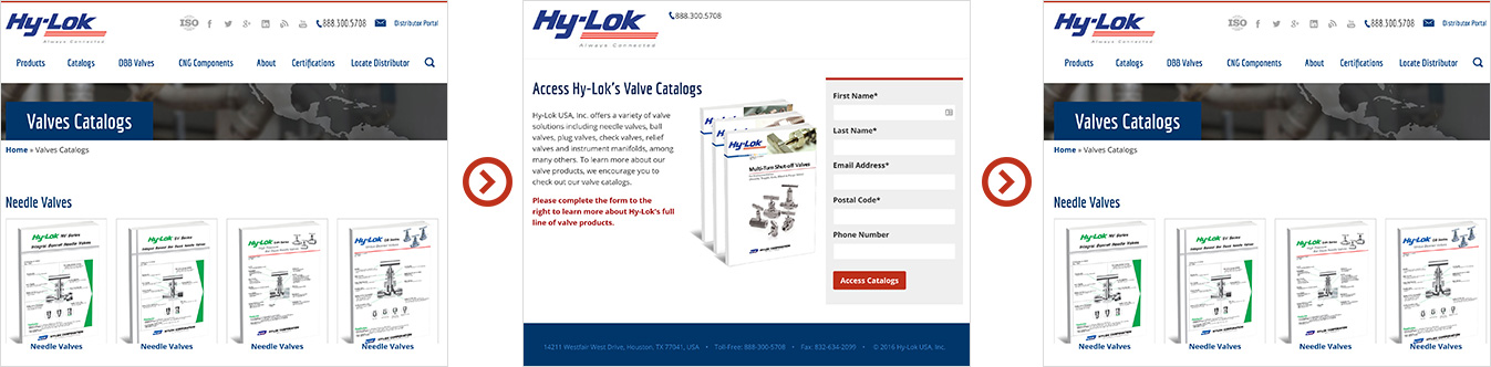
Even though this introduced an additional step, with the user being able to confirm that the catalog they were looking for was in the library of catalogs, they were more likely to fill out the form and become a lead.
We were able to increase new leads generated by 15% by making both sets of catalogs follow the latter.
Overcoming the Fold with Vertical Media Queries
When a user views a website on a desktop computer or laptop, the most common internet browser size is 1350 pixels by 640 pixels. Before starting a GDD program, this is what a common visitor saw when he or she came to the two most popular pages:
As you can see, even though they still get a decent overview of the page, there’s still room for improvement, especially with the content that’s directly below the fold.
Similar to how a responsive website traditionally adjusts depending on the width of a device/browser with media queries, we can also adjust the size of the website depending on the height. This can be done with the help of vertical media queries, which is an often overlooked aspect of responsive websites. We simply lowered the body font-size by 25% for anyone on a browser with a height that was less than 640 pixels without having to resize every individual element. This proportionately reduced the size of every element on the page to the following:
Now in both windows, the CTAs are fully visible and the distributor locator section/links are now in the viewport. With this improvement, we were able to increase the engagement with the distributor locator by 24%, CTA engagement by 10.7%, and overall new leads generated by 3.4%.
Form Popups vs Landing Pages
Building on our other improvements, we wanted to get users to their desired catalog quicker.
Where we last left off, the user journey once someone clicked on a link/CTA to a catalog page was the following:
Even though this helped us increase conversions, the process still seemed a bit cumbersome. In order to simplify the process and still collect the visitor’s information, once the visitor clicked on a thumbnail, instead of taking them to the landing page with the form, we presented the form via lightbox.
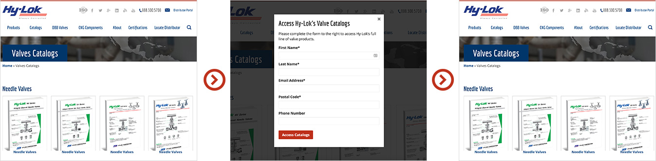
By removing the landing page out of the equation, we simplified the process and increased all catalog form submissions by 60.5% and new leads generated by 23.79%.
A few final things to note with this program.
- Traffic was stable throughout the seven months of testing and iterations averaging 15,000 unique visitors per month.
- Just because this worked for my client, it doesn’t mean it’ll work for yours — each website is a living a breathing organism whose conversion factors vary.
- You need to tailor each GDD test according to the website set up and business needs.
- These techniques were specific to inbound/content marketing.
- Lower the body font-size won't proportionately lower the size of everything unless the website is setup in ems.
- HubSpot was used for marketing automation.
- Optimizely was used for A/B testing.

I'm Julian, a product design leader and developer with a habit for experimenting (I did some cool stuff at Thomasnet.com). I mostly write about what I'm working on related to product design, front-end development, and experimentation.
While you're here, I'm currently in the market for a design leadership gig. If you're interested in working together, hit me up, or feel free to share my resume.
Notes From the Field

Designing Multi-Sided Platforms
A comprehensive guide on designing the experience and growing the engagement of networked markets.

A Pragmatic Approach to Design Principles
How we took our design culture from executive-centric to user-centric with the help of pragmatic design principles.

Server-Side Split Testing for Static Websites
When to use, when to avoid, and setting up your A/B testing stack.

How We Adopted CSS Grid at Scale
From team buy-in to fallbacks, here's the approach we took at Thomas with the implementation of CSS Grid.

Don't Fight The Notch — Designing for the iPhone X
Coming to terms with the notch on the iPhone X and its effect on mobile design.

Lessons Learned After Running 300 A/B Tests on 20 Different Websites
Over the past 2 years I’ve dedicated part of my career to building a conversion rate optimization (CRO) team from the ground up. Here's what I've learned.