Table of Contents
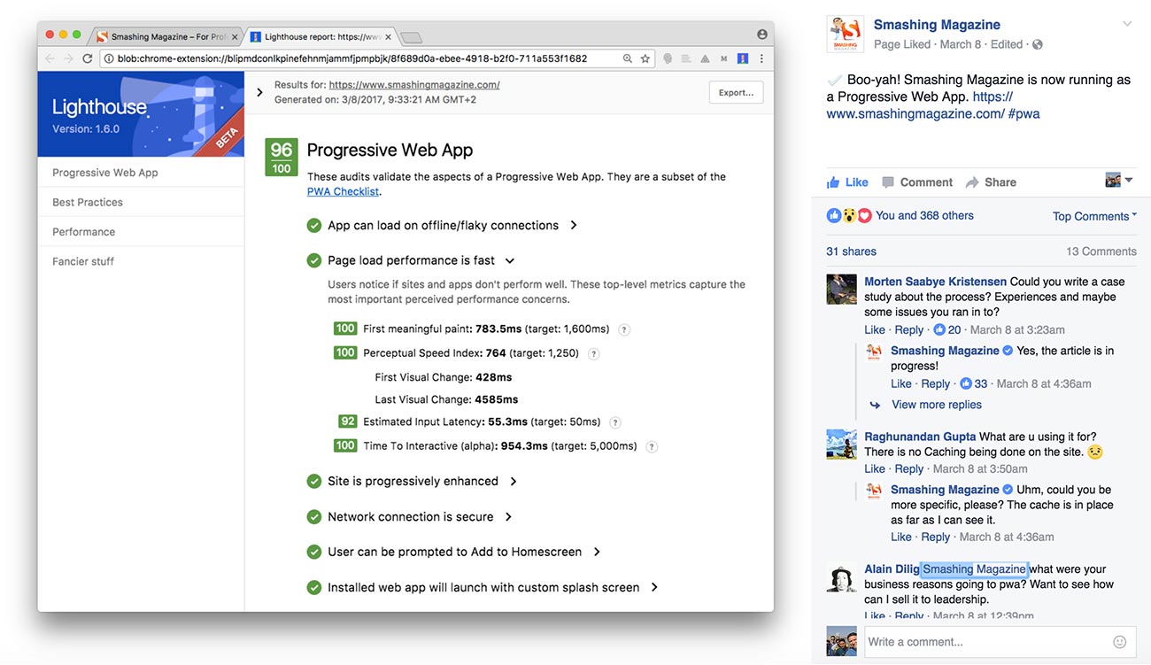
Late last week, Smashing Magazine, one of the largest and most influential online publications for web design, posted on Facebook that their website was “now running as a Progressive Web App.”

Honestly, I didn’t think much of it. Progressive Web Apps are for the hardcore web application developers creating the next online cloud-based Photoshop (complicated stuff), right? I scrolled on and went about my day.
(Related: Static Websites + JAMstack = <3)
Then, I saw CSS wizard, Harry Roberts, tweet about making some setting changes in CloudFlare and achieving the same. It might have been a coincidence that I stumbled across two influencers discussing the same topic, but it still caught my eye. So out of curiosity, I installed Lighthouse, the Chrome plugin that both Smashing Magazine and Harry Roberts had used, and ran my website through it.

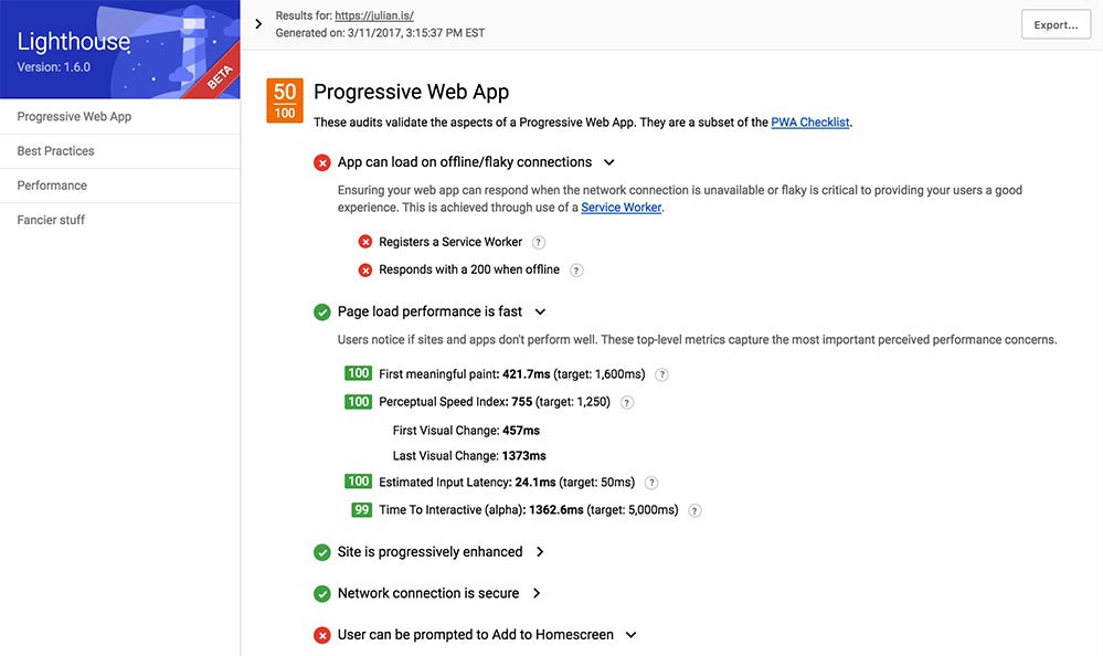
I wasn’t too impressed with the results. I figured I’d look into this, write about it, and save any developers who stumble across my website a bit of time. But I was really surprised with what I found.
I sought out to see if PWAs could benefit the work I do daily with content marketing websites, and I was able to reach 100/100. You’ll see exactly what I did toward the end of this article, but I figured while I’m here, we could walk through it together.
To begin, let’s get on the same page and define exactly what a PWA is. Google (you might have heard of this company before) says:
Progressive Web Apps are user experiences that have the reach of the web, and are:
- Reliable - Load instantly and never show the downasaur, even in uncertain network conditions.
- Fast - Respond quickly to user interactions with silky smooth animations and no janky scrolling.
- Engaging - Feel like a natural app on the device, with an immersive user experience. This new level of quality allows Progressive Web Apps to earn a place on the user’s home screen.
In other words, a PWA is the inbetween of a native app and a website. Using new technology being shipped with the latest browsers, we’re now able to create web apps, or in this case websites, that feature similar functionality as native iOS & Android apps (push notifications being a popular one).
The beauty of it is that we don’t need to be on a specific platform to be able to install a specific app — we just need a URL to point our mobile or desktop browsers to — but it is also one of the most challenging aspects of PWAs because ANY browser on ANY device could access the web app.
This means that we’ll be catering to users that probably won’t have the latest version of their browser with the latest features that you’re using. And that’s OK.
PWAs are built with the core principle of the progressive enhancement. This means the app/website will focus on the core content or purpose, and it will use the latest and greatest features as an enhancement to the experience and not as a requirement. It won’t break or render useless if a specific feature isn’t available in the browser/device accessing it.
Why Your Website Should Be a Progressive Web App
Although you probably won’t be using any hardcore app-like features for your website, there are a handful of enhancements, such as offline accessibility and native browser notifications, that will immediately improve the overall usability and engagement of your audience. It’ll result in higher conversions and lower bounce rates.
There’s even more to it:
Offline Accessibility with Service Workers
Using service workers, we’re able to “download” your website for offline use. Even with our tech-savvy way of life, there are plenty of use cases for this — subway riders with no internet access reading your blog, plant managers with spotty wifi looking up specs, those driving into more rural areas, etc.
(Keep reading — I get a bit more detailed on this later on.)
Native Browser Notifications
If the website validates as a PWA, certain browsers take the initiative of displaying notifications such as offering to add the website to the home screen of the user — the PWA equivalent of installing an app.
Enabling Push Notifications
Push notifications are every developer and marketer’s favorite native app feature. When leveraging the Push API, you have the ability to re-engage your audience even when your website’s not being accessed.
Performance
With service workers, we have granular control over caching static assets, which reduces network requests and results in improved performance.
Google Likes it
If Google supports something, pay close attention. It won’t be long until Google starts favoring PWAs in certain search results. (You heard it here first!) Right now, there isn’t any evidence showing an increase in traffic; however, early adopters are usually the ones to reap the benefits.
Still not convinced? Here’s some relevant proof:
- Housing.com increases conversions and lowers bounce rate by 40% with new PWA
- United eXtra Electronics grows eCommerce sales by 100% with Web Push Notifications
- 5miles decreases bounce rate by 50% and increases conversions by 60% with new Progressive Web App
- Alibaba.com increases conversions on the mobile web by 76% with Progressive Web App
Criteria for Progressive Web Apps
Your website has to meet a baseline of standards in order to benefit from the PWA perks, but these are best practices you should already be considering and implementing on your website. If not, listen up.
Site is served over HTTPS
This is the secure version of your website. Sending information over HTTPS ensure any data that’s being passed through your website gets encrypted. Yes, even if your website is a simple content-based website with no complicated features, you want and need HTTPS (lots of bad hombres out there).
You can test for this with Lighthouse or just look at the address bar of your website and if the URL starts with https:// and not http://, you’re good to go. I use CloudFlare CDN, which makes it relatively simple to enable HTTPS.
Pages are responsive on tablets & mobile devices
By now, everyone should be building on a responsive foundation. Do I even need to elaborate here? Thinking no, but let me know otherwise.
The start URL (at least) loads while offline
Your home page URL needs to be able to load if you don’t have access to the internet — use service workers (not as difficult as it sounds) to help. (I’ll show you how to do this shortly.)
Metadata provided for add to home screen
Mobile browsers need basic information about your website such as an icon to represent your website on the home screen of a device, a short name (what gets displayed below your icon) and a browser theme color to match certain parts of the browser to the colors of your website (among many other options).
This gets accomplished through the web app manifest file, which is a simple JSON file that contains all of the specifics. (Again, I run you through setting one of these up toward the end of this post.)
First load is fast even on 3G
Your website needs to render fast. It should load within the first 4 seconds and get a 85+ PageSpeed Insights score as a minimum. I recently wrote an article on website speed performance, which goes over a few basic steps you can take to make sure your website loads pretty darn quick.
Site works cross-browser
Every single feature doesn’t have to work on every browser but being able to progressively enhance and using fallbacks where necessary should be the foundation of your website or app. Don’t target a specific browser or OS for your website/app to work on — it’s a big negative that goes against the progressive principle.
Page transitions don't feel like they block on the network
Going from page to page should be a seamless experience — any type of render blocking delay deters you from achieving that. There are many ways to address this from making sure your website’s fast (two steps above) and using perceived performance techniques such as Critical CSS.
Each page has a URL
If you click on a page, make sure the website URL reflects that. Single Page Applications sometimes forget this and make it pretty difficult to share content across the web.
Seems like a handful of steps, but if your website is already built on a foundation of best practices, it won’t be much work to have it validate.
Getting My Website to PWA Status in Two Hours
Curious and determined, I went ahead and started addressing one by one the issues that my initial Lighthouse report came back with.
I had to address:
- App can load on offline/flaky connections
- User can be prompted to Add to Home screen
- Installed web app will launch with custom splash screen
- Address bar matches brand colors
And off to optimization land I went.
First Step: Enable Service Workers
To reach the baseline of a PWA, we’re looking to provide a rich offline experience with the caching capabilities of service workers. On top of regular file caching, Service workers goes the extra mile to cache network responses and pretend to still have internet access (even if you’re in the middle of an internet deadzone).
To start the installation of service workers, place the following script in your global footer (unless you only need/want service workers on a specific section of your website):
if ('serviceWorker' in navigator) {
  window.addEventListener('load', function() {
    navigator.serviceWorker.register('/sw.js').then(function(registration) {
      // Registration was successful
      console.log('ServiceWorker registration successful with scope: ', registration.scope);
    }).catch(function(err) {
      // registration failed :(
      console.log('ServiceWorker registration failed: ', err);
    });
  });
}
Next, create a JS file named sw.js and place it in the root directory of your website with the following code:
(Note: Make sure that style.css and production.min.js are replaced with your site’s specific CSS and JS files.)
var CACHE_NAME = 'site-cache';
var urlsToCache = [
  '/',
  '/style.css',
  '/js/production.min.js'
];

self.addEventListener('install', function(event) {
  // Perform install steps
  event.waitUntil(
    caches.open(CACHE_NAME)
    .then(function(cache) {
      console.log('Opened cache');
      return cache.addAll(urlsToCache);
    })
  );
});

self.addEventListener('fetch', function(event) {
  event.respondWith(
    caches.match(event.request)
    .then(function(response) {
      // Cache hit - return response
      if (response) {
        return response;
      }

      // IMPORTANT: Clone the request. A request is a stream and
      // can only be consumed once. Since we are consuming this
      // once by cache and once by the browser for fetch, we need
      // to clone the response.
      var fetchRequest = event.request.clone();

      return fetch(fetchRequest).then(
        function(response) {
          // Check if we received a valid response
          if (!response || response.status !== 200 || response.type !== 'basic') {
            return response;
          }

          // IMPORTANT: Clone the response. A response is a stream
          // and because we want the browser to consume the response
          // as well as the cache consuming the response, we need
          // to clone it so we have two streams.
          var responseToCache = response.clone();

          caches.open(CACHE_NAME)
            .then(function(cache) {
              cache.put(event.request, responseToCache);
            });

          return response;
        }
      );
    })
  );
});
For now, this is exactly what we need to cache a 200 network response. I strongly recommend you get the specifics on the code above by going through the following documentation on the Google Developers website:
If you disconnect from the internet and refresh this page, the browser responds with a 200 (successfully connected) instead of a “no Internet connection”.
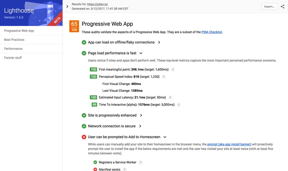
This took care of the “App can load on offline/flaky connections” error and bumped my score up to 65/100.

We’re getting there!
Second Step: Add The Web App Manifest
The web app manifest is a JSON file that allows you to control the look and feel of your theme in areas that you would otherwise not be able to modify. You have options such as: changing the color of the browser chrome; not displaying any chrome at all in order to give your website/app the standalone app look and feel; providing additional metadata to devices for when a user “installs” it to their home screen.
Create a JSON file and name it manifest.json then add this file to the root of your domain. Mine looks like this:
{
  "short_name": "julian",
  "name": "Julian Gaviria — Web Designer",
  "icons": [
    {
      "src": "img/jg-launcher-icon-1x.jpg",
      "type": "image/png",
      "sizes": "48x48"
    },
    {
      "src": "img/jg-launcher-icon-2x.jpg",
      "type": "image/png",
      "sizes": "96x96"
    },
    {
      "src": "img/jg-launcher-icon-4x.jpg",
      "type": "image/png",
      "sizes": "192x192"
    }
  ],
  "start_url": "/?utm_source=homescreen",
  "background_color": "#23507a",
  "display": "standalone",
  "theme_color": "#23507a"
}
Link to the file from within the <head> of your website with the link tag:
<link rel="manifest" href="/manifest.json">
With this specific setup I’ve defined:
- The name of the website
- The icon that will be used when the website gets added to a home screen (in three different sizes)
- The name that will sit below the icon
- The URL that the website will open to if accessed from a device’s home screen
- Background color for the device (instead of showing a blank white page when browsing between pages)
- Theme color for the browser chrome (UI areas of the browser and not the website)
You can go ahead and copy the code above (obviously replacing my information with yours). Mozilla has provided detailed documentation of all the attributes and values of web app manifest file.
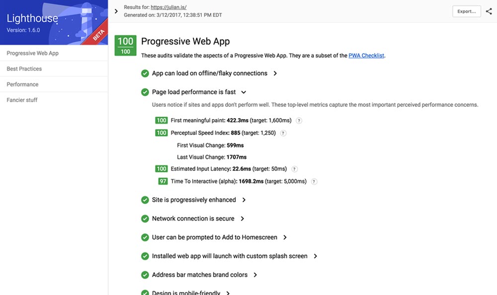
This addressed issues two through four and improved my Lighthouse score to 100/100.

Mission accomplished! Told you it wasn’t rocket science.
Additional Information and Things to be Wary of
Browser Support: Who’s Backing This?
Google and Mozilla are the main players here with strong support from Microsoft and Samsung. Apple’s being a bit stubborn and throwing their mobile weight around since this presents a threat to their iOS ecosystem. (My original theory was that they’re upset they didn’t come up with the idea first… and I’m tempted to stick with it.)
Since the strategy behind progressive enhancement is to start with an emphasis on the core content of a website and add features to enhance the experience, PWAs will just work on iOS devices. However, as of late, it seems like Apple is beginning to have a change of heart by considering service workers as part of their 5 year plan; better than nothing, but the web will move forward without them.
Difference between PWA and Google’s Advanced Mobile Pages
These are two different types of approaches solving two different types of problems:
AMP is focused on providing content at lightning speeds to the user, regardless of the type of internet connection, mostly from search results and geared toward blogs and news articles.
PWA is focused on providing rich and engaging experiences along with reliable performance to users on revisits regardless of the type of content.
Nothing’s stopping you from using both — actually, PWAs and AMPs work really well together.
Disproving a Few Myths
I came across a few interesting statements while doing some research on the topic that I don’t agree with and don’t think you should either.
Myth #1:
Benefits don't outweigh the time it takes to implement the functionality at the moment
It took me about two hours to go from a 50/100 score to a 100/100 score. (Check the timestamp on the Lighthouse screenshots.) It’ll take you even less time to copy and paste code samples I provided onto your website. (Big thanks to me for doing your legwork — you’re welcome.) It’s safe to say that two hours seems like a worthy investment for reaping the engagement benefits.
Myth #2:
It's pretty much required that you're going to be using some form of JS framework or view library, like Angular or React.
My site runs on a static site generator (just straight up HTML files). It’s made up of simple HTML, CSS and good ol’ jQuery. No component based, data binding, dynamic, complicated JS framework here.
If you skipped the beginning of this article, I’ve outlined exactly what the PWA criteria is (and it’s not React or Angular). Scroll back up!
Myth #3:
You'll need to be pre-rendering pages on the server then picking up with your application when it's loaded.
I don’t even know what this means, but it didn’t seem like the author of that article did either.
Myth #4:
You're in the world of clever JS front-end technologies to make sure you do things the PWA way.
I’m actually a designer. I just happen to dig code.
Not to discredit myself or to say that what I do is easy, but I hope it illustrates that the baseline for a PWA is relatively simple. Let’s not make things sound more complicated than what they are.
(By the way, I copied and pasted the statements above from their sources.)
What Now?
This is just the tip of the iceberg. I want to see what the possibilities are with push notifications, test the boundaries and use cases with service workers and maybe even create a PWA/AMP hybrid version of my website.
I believe these are the next steps in our journey for a unified and accessible web that started with responsive web design in 2011. I’m excited and by the looks of it, and you’re probably very excited as well. If not, I have no idea how or why you made it to the end of this very long article.
PWA Resources
I put together a separate page for articles, videos, podcasts and tutorials that I came across. I hope this helps you out. Enjoy!

I'm Julian, a product design leader and developer with a habit for experimenting (I did some cool stuff at Thomasnet.com). I mostly write about what I'm working on related to product design, front-end development, and experimentation.
While you're here, I'm currently in the market for a design leadership gig. If you're interested in working together, hit me up, or feel free to share my resume.
Notes From the Field
Designing Multi-Sided Platforms
A comprehensive guide on designing the experience and growing the engagement of networked markets.
A Pragmatic Approach to Design Principles
How we took our design culture from executive-centric to user-centric with the help of pragmatic design principles.
Server-Side Split Testing for Static Websites
When to use, when to avoid, and setting up your A/B testing stack.
How We Adopted CSS Grid at Scale
From team buy-in to fallbacks, here's the approach we took at Thomas with the implementation of CSS Grid.
Don't Fight The Notch — Designing for the iPhone X
Coming to terms with the notch on the iPhone X and its effect on mobile design.
Lessons Learned After Running 300 A/B Tests on 20 Different Websites
Over the past 2 years I’ve dedicated part of my career to building a conversion rate optimization (CRO) team from the ground up. Here's what I've learned.
