Table of Contents
Websites have reached a point where the maturity of graphic design has caught up with the state of web development. But what about accessibility? As the web keeps getting prettier to look at, it also keeps getting heavier and slower to load. Page speed is a limitation that influences creativity and impacts accessibility, but unfortunately it is also a behind the scenes act that usually gets overlooked.
(Related: Progressive Web Apps — The Next Step in Responsive Web Design)
Saving images for the web isn’t cutting it anymore; we now have to take into consideration perceived load time, Gzip, CDNs, post-photoshop image optimization, etc, just to make our websites accessible (and to make Google happy, let’s not forget). Seems as though we’re going backwards, but even though browsers and computers keep getting faster and faster, we now have a slew of mobile devices that we need to support (all depending on your target audience).
I’m not going to bore you with the philosophical approach of how you should be considering website performance as early as kindergarten graduation (don’t get me wrong, the design phase matters a ton, and starting the conversation of performance early on allows you and the client to make better decisions down the road), but instead what you’ll find below is solid baseline and actionable steps to immediately make your website faster & more accessible.
Gzip the hell out of everything
Gzip is the wizard behind the curtain that makes the web as a whole much faster to navigate; it is data compression that takes place when a file gets requested from a server and delivered to the browser. When enabled, Gzip compresses file transfers by as much as 70-80%.
Technically, you can Gzip any file on your website but due to the time it takes to process, the only files worth gzipping are the big three: HTML, CSS, & JS. Images and videos are already compressed (they better be if you’re producing these assets for the web) and the amount of time it would take Gzip to compress them further would outweigh the amount of load time saved with the smaller file size.
However, Gzip doesn’t get enabled by default on most hosts (you can check to see if your website’s Gzipped). Setting this up is usually on the server side and depending on your hosting company, you can just reach out to them and ask them to enable it. This can also be done via the .htaccess on Apache with the following code snippet:
SetOutputFilter DEFLATE
AddOutputFilterByType DEFLATE text/html text/css text/plain text/xml text/javascript application/x-javascript application/x-httpd-php
BrowserMatch ^Mozilla/4 gzip-only-text/html
BrowserMatch ^Mozilla/4\.0[678] no-gzip
BrowserMatch \bMSIE !no-gzip !gzip-only-text/html
BrowserMatch \bMSI[E] !no-gzip !gzip-only-text/html
SetEnvIfNoCase Request_URI \.(?:gif|jpe?g|png)$ no-gzip
Header append Vary User-Agent env=!dont-vary
There are different versions of Gzip depending on your host. Check that the above code works on your specific setup.
Use a CDN service to delegate content delivery
A Content Delivery Network (CDN) serves 3 main purposes: lowering bandwidth costs, global availability of content, and faster loading times.
Your website exists on a server somewhere in a physical location; when someone visits your website, the user’s browser makes a request to this server for all of the files that make up your website (images, HTML, JS, CSS, etc). The time it takes for a website to load largely depends on the physical distance between the server (where the website is hosted) and the location of the person/computer visiting the website.
For example, below is a website without a CDN being hosted in Illinois accessed by an ISP in New York City & an ISP in Japan:
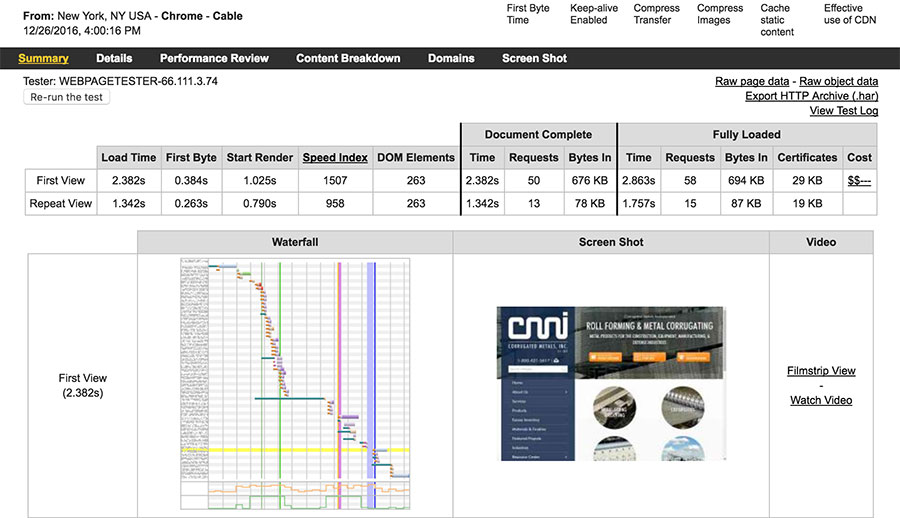
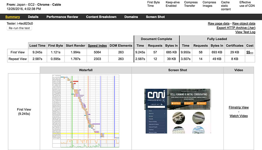
Due to the location of the server, accessing the website from Japan took around 4 times longer to initially load than it did when it was accessed from NYC. A CDN solves this by distributing your website’s assets to servers around the world and delivering it from the closest server possible from where the website is being accessed.
Below are the same two tests done to my website, which is using a CDN:
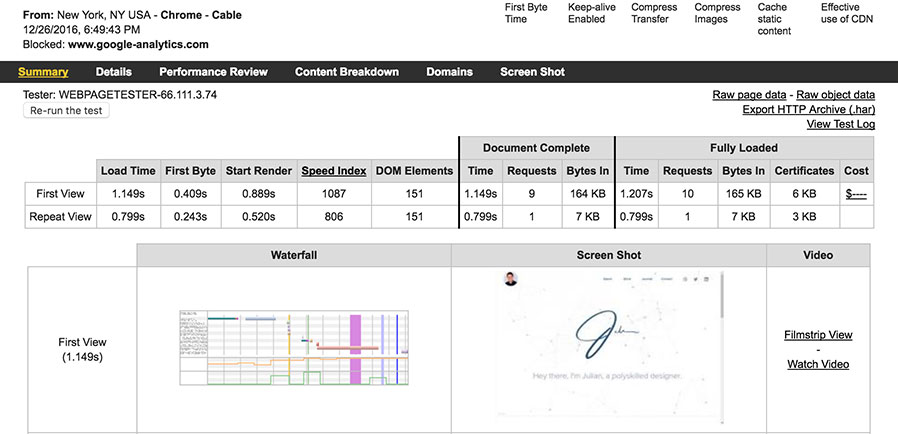
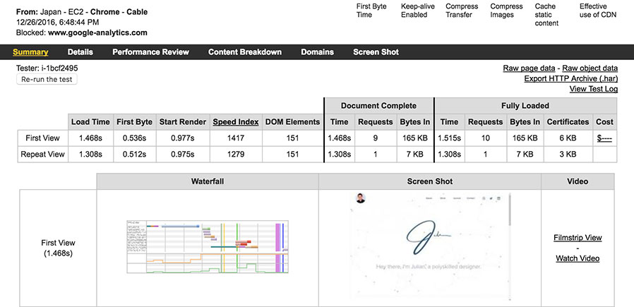
The loading times here are relatively similar despite the distance of the two locations where the request was made. Both ISPs were served the content of my website from a server relatively close to their physical location which kept loading times down to a minimum.
Seems pretty effective, but you probably need the knowledge of a senior back-end developer to set this up, right? Nope, all you need is the ability to change your domain’s nameservers to the ones provided by your CDN service of choice (I use CloudFlare) and you’ll be good to go. Nothing on the hosting end changes and this won’t break the bank. Do it now!
Image optimization beyond “save for web”
Let’s start with the baseline: images should be saved at no higher than 60% quality when exporting from any image editing software (mostly Photoshop). This is the difference between a 1000x650 JPG weighing 330kb when saved at 100% and the 1000x650 JPG weighing 88kb at 60%. Yes, this matters when every other website nowadays includes 3+ hero images rotating on the homepage.
If we save below 60%, the quality of the image begins to visibly drop. However, we can apply additional image compression that removes bloat added by metadata and unnecessary code (yes, images are made up of code) without affecting the quality of the image. Since Photoshop doesn’t take the initiative to remove this bloat, we can turn to tools such as ImageOptim or the web based jpeg.io to do the heavy lifting.
Download your website’s images folder, run it through ImageOptim, and reupload it. Google PageSpeed Inisghts will thank you.
What about PNGs?
Not all images are created equally; PNGs tend to be way heavier than JPGs mostly because of the complexity of their transparency capability. Transparency in modern web design is necessary, but can easily get out of hand with an optimistic designer focusing on just the aesthetics.
Here’s where ImageAlpha comes into play; similar to ImageOptim, ImageAlpha caters specifically to PNGs.


That’s a 64% reduction in size. Keep in mind that running images through ImageAlpha does decrease the compatibility of the PNG in older browsers such as IE6 (but if you’re still supporting IE6, I guess you have bigger things to worry about).
Can’t we use SVGs for transparency?
Yes you can! But this should be limited to simple flat graphics such as my logo or the social media icons on this site. SVGs are great for presenting vector graphics that are resolution independent; you can scale my logo to be 10x bigger without pixelating or increasing file size. You can also directly embed SVGs into a web page without linking out to another file and therefore avoiding the extra HTTP request made to the browser. Technically, you can transform a complex graphic such as the 3D cover above into vector and present it as an SVG, but this will end up weighing significantly more than a PNG (just don’t do it).
There are many advantages SVGs but this deserves a blog post of it’s own (if not a book). A handful of developers such as Sara Soueidan & Chris Coyier dedicate a good chunk of their careers to the complexities of SVGs.
Perceived Performance
Sometimes it’s more about how fast a website seems and not so much about the actual loading time. Humans are impatient and need to get entertained while they wait, if not they complain or, even worse, leave. Take for example the situation at a Houston airport where passenger complaints were overwhelmingly high in regards to the long waits at baggage claim. Instead of reducing wait times, airport executives increased the walking distance between the arrival gates and baggage claim. Passengers were now spending most of their time walking to baggage claim and by the time they arrived the wait time, if any, was minimal. Complaints suddenly disappeared.
The same concept applies to websites. The faster we see a website load, whether it’s completely loaded or not, the faster we get entertained and the likelihood of sticking around on the website increases. CSS goes against this concept; it will not paint a website until the entire CSS file has loaded. Not to mention that CSS is also render-blocking, that’s right, no other assets on the web page will load if CSS hasn’t finished loading. The reason this isn’t as big of a deal as Javascript being render blocking is because CSS files are usually lightweight and don’t take up much processing power. However, websites are now becoming very CSS heavy and we’re starting to see the implications in the start-render time (the time it takes for a website to go from a blank screen to showing anything).
The fix? Inlining the CSS that’s needed to show the content above the fold (or the most common viewport size of your website); this allows for the most critical part of the website, what the user sees, to load first without having to wait for the rest of the CSS file to load.
Below you’ll see an example of the same website with Critical CSS enabled:

Even though both versions of the website have the exact same assets to load, the start-render time of the Critical CSS version was 67% faster than the original.
This can get easily automated with the use of a Gulp/Grunt plugin. Smashing Magazine wrote a detailed article on the subject with great insight on how to use in production.
Let’s not forget the basics
Some of the basics become second nature to us and become a blind spot when speaking about our process. With that in mind, here are a few rules of thumb to ensure a fast website:
- Minify and concatenate all of your JavaScript and CSS
- Avoid using unnecessary images that don’t add value to the page
- Avoid duct taping your website with plugins since most inject bloated code and add unnecessary HTTP requests
- Create animations using CSS instead of JavaScript
- Use a task manager such as Gulp or Grunt to automate all speed optimization efforts
Do you have straight forward & quick to setup techniques you include in your websites? Join the conversation on Twitter.

I'm Julian, a product design leader and developer with a habit for experimenting (I did some cool stuff at Thomasnet.com). I mostly write about what I'm working on related to product design, front-end development, and experimentation.
While you're here, I'm currently in the market for a design leadership gig. If you're interested in working together, hit me up, or feel free to share my resume.
Notes From the Field
Designing Multi-Sided Platforms
A comprehensive guide on designing the experience and growing the engagement of networked markets.
A Pragmatic Approach to Design Principles
How we took our design culture from executive-centric to user-centric with the help of pragmatic design principles.
Server-Side Split Testing for Static Websites
When to use, when to avoid, and setting up your A/B testing stack.
How We Adopted CSS Grid at Scale
From team buy-in to fallbacks, here's the approach we took at Thomas with the implementation of CSS Grid.
Don't Fight The Notch — Designing for the iPhone X
Coming to terms with the notch on the iPhone X and its effect on mobile design.
Lessons Learned After Running 300 A/B Tests on 20 Different Websites
Over the past 2 years I’ve dedicated part of my career to building a conversion rate optimization (CRO) team from the ground up. Here's what I've learned.
