

Thomasnet.com is the leading industrial sourcing platform with a monthly active user base of over 1.7 million buyers and suppliers. The company primarily relies on a premium subscription revenue model for suppliers while allowing buyers to use the platform free of charge.
Part of the work to create a unified user and company account experience for Thomasnet.com included a complete rebuild of the ROI tools for premium suppliers. A high-stakes feature that would transform ROI reporting and become the primary upsell driver for one of the most known brands in the industrial B2B space.
Getting Familiar with the Problem
An information exchange platform with a revenue model based on exposure, Thomasnet.com’s legacy ROI reporting tools focused on the number of views the supplier received on the platform and who viewers were.
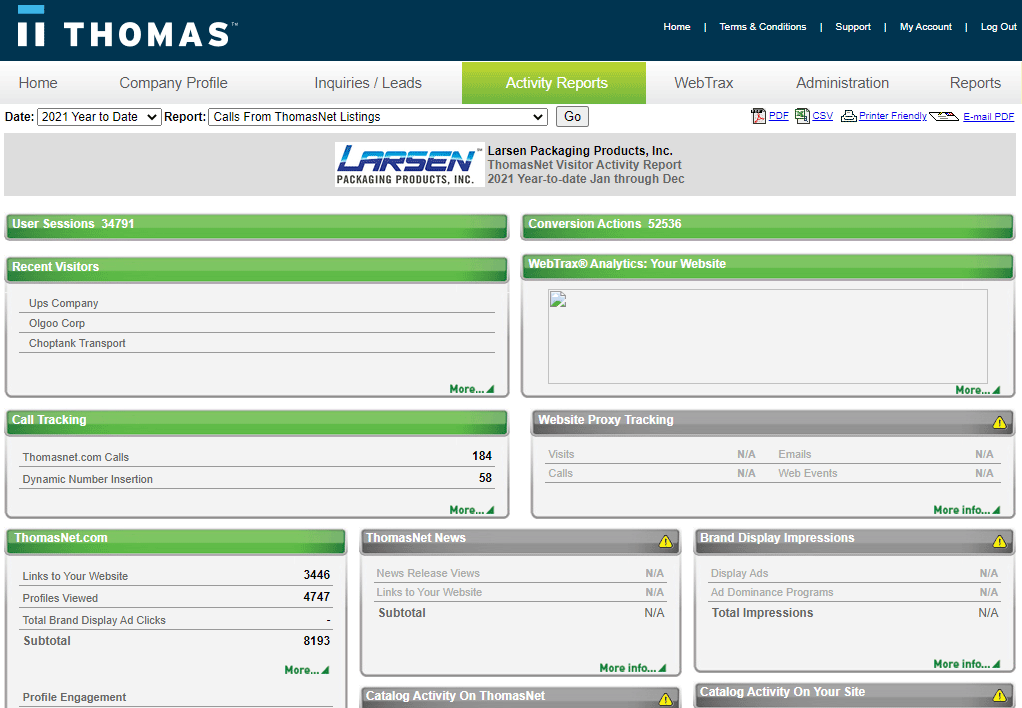
Supplier's Legacy ROI Dashboard
The problem with this approach is we set ourselves up to compete against Google in a lopsided numbers game. In reviewing feedback from non-renewals, the number one reason suppliers left Thomas was Google.
Through a combination of Google Ads and SEO, most suppliers saw more referral traffic to their site at a lower cost. Technically, this is true, not just for Thomasnet.com but for any information exchange platform agnostic of industry.
However, the quality of traffic from Thomas was significantly higher, with visit-to-contact conversion rates of around 4% vs. 0.95% from Google. And unlike Google, we could provide buyer-intent information at a company level — the number one reason suppliers renewed.
The Objective
The primary objective was to streamline ROI reporting by creating a unified and scalable experience within the newly established Thomas Account and sunsetting the suite of disparate legacy reporting tools and processes.
For the business, the ROI dashboard needed to focus on the qualitative value that Thomasnet.com brings to suppliers and increase revenue through higher retention and upsell rates.
For users, the objective was to create a seamless user experience that transparently and in real-time communicates to suppliers where they can improve, where they’re overcompensating, and what the current and potential ROI is of their investment in Thomasnet.com.
My Role
I played the player/coach role of lead designer with the additional responsibilities of a product manager. I worked directly with our engineering leads and data architects throughout the course of the project while maintaining the relationships and setting expectations with stakeholders and executive leadership.
Discovery, Research, & Insights
We immediately went to work by speaking to the folks around the organization that dealt directly with premium subscribers.
Our internal sales team had valuable insight into the narrative during upsell calls. We also had an in-house agency department that offered marketing services to industrial manufacturers. This uniquely positioned us to get first-hand feedback from one of our target audiences — marketing agencies.
And we went straight to the users. With a combination of existing feedback provided by our customer success team and preliminary user tests with the existing dashboard, we had a baseline understanding of what users were expecting.
We curated our discoveries into a list of key insights that would guide us throughout the project.
Key Insights
- Users don’t have access to the info necessary to inform their decision to renew.
- Users have trouble accessing their current dashboard and mostly depend on sales reps relaying information.
- Users lack real-time access to their premium membership details and respective results.
- Only premium suppliers have access to ROI tools.
- Users would like to know where they stand in comparison to their competitors.
- Users view the current experience as cumbersome.
- Users would like to know where they can improve.
“How Might We” Questions
To make sure we covered all angles and create a level of shared understanding, we gathered data, tech, design, & key stakeholders to brainstorm “how might we” questions respective to the key insights.
How might we…
- Surface buyers with a higher level of engagement?
- Communicate where suppliers stand in comparison to their competitors?
- Provide suppliers with available market context of Thomasnet.com?
- Balance a single experience for both sales and marketing?
- Empower users with a self-serve experience?
- Create upsell opportunities?
- Simplify the experience?
- Make the dashboard more accessible?
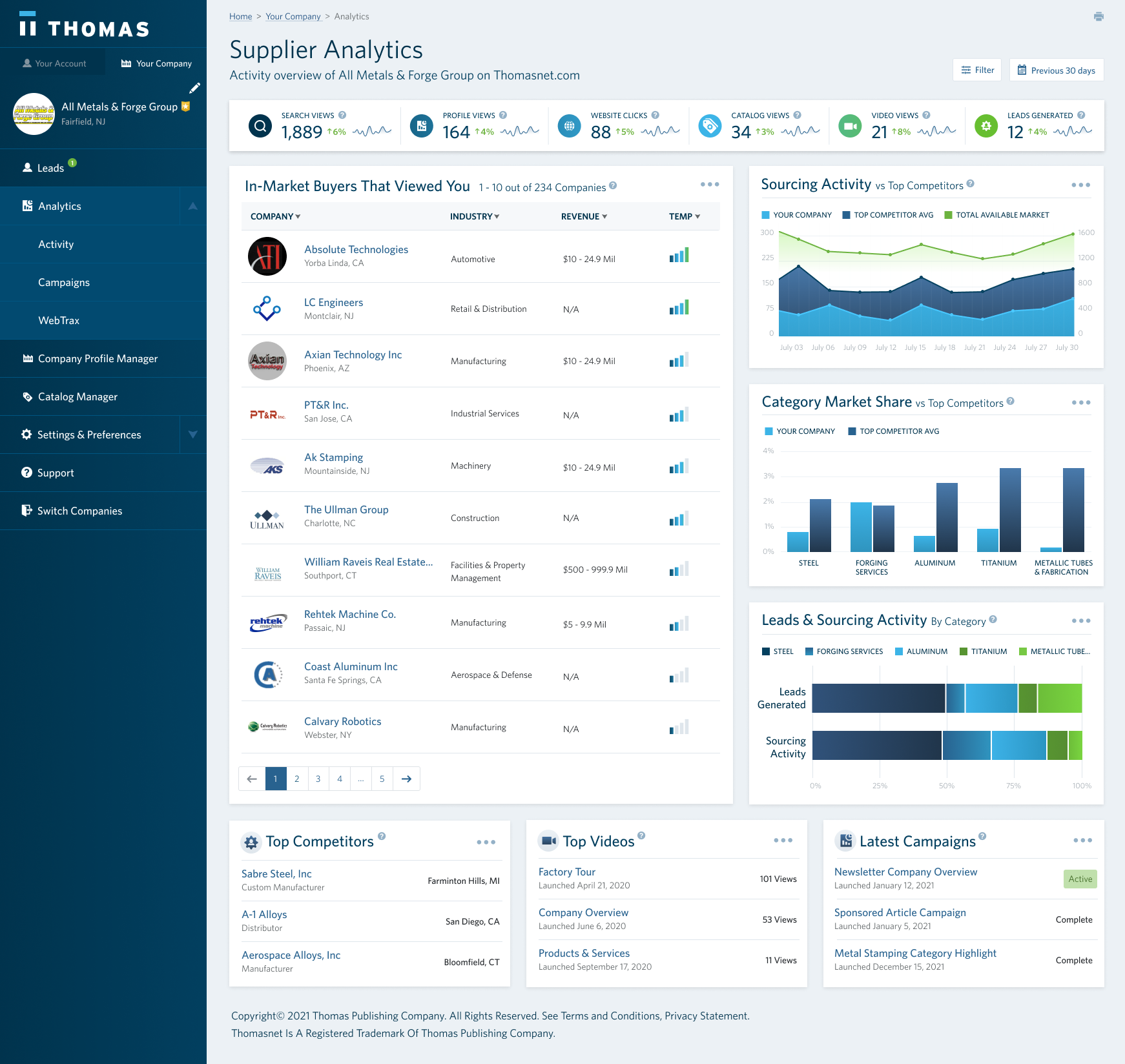
Designing the Information Architecture
We decided to start with a baseline information architecture focused on a centralized dashboard that lives under the Thomas Account. We needed to branch out into details about the companies that viewed the supplier, details on users engaging with their uploaded assets, and information on their paid campaigns.
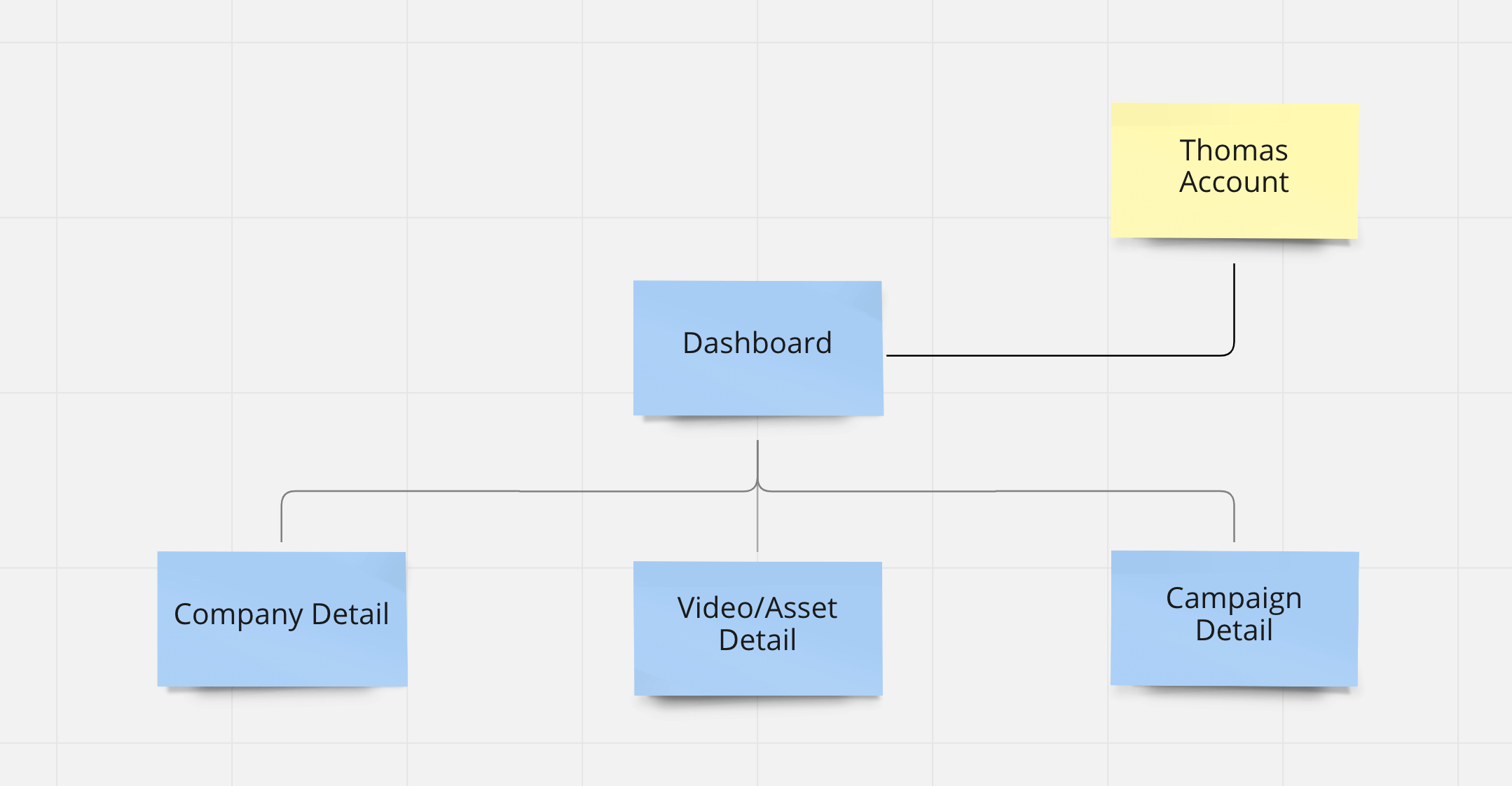
Baseline Information Architecture
We were also careful not to create an information architecture that forced a specific user experience. Whether we presented the child items as information on the dashboard, or separate pages accessed through the navigation, we would make the necessary design decisions as we become better informed.
Based on this information, we went to work on designing the initial wireframes of the dashboard:
First stab at a simple reporting dashboard
Working with black and white mockups allowed us to iterate quickly with existing design assets & components while communicating that this was not intended to be a high-fidelity mockup.
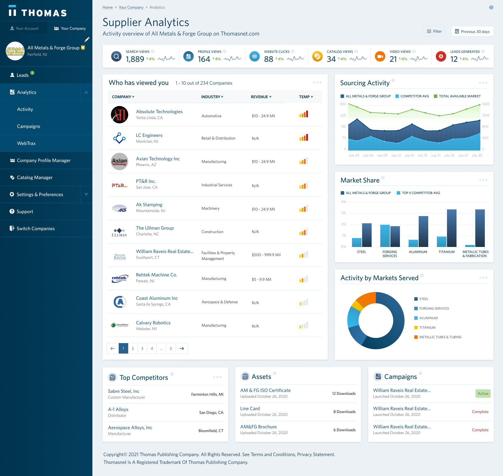
We skipped on a primary graph common with most dashboards. Instead, we dedicated more screen real estate to the qualitative data while still surfacing the quantitative metrics that marketers expect.
Instead of sorting companies by date, we introduced the concept of a temperature gauge. The intent was to introduce a formula that would surface the companies with the most interest based on engagement level, recency, & relevance.
After a round of user tests and stakeholder reviews, we were made aware that what we had was still falling short in enticing users to renew. We brainstormed with the data team, and after a few iterations, we came up with the following:
Final Low-Fidelity UI
We introduced a column of graphs meant to give suppliers context to where they stand and where there’s room for improvement compared to the total market on Thomasnet.com. Spot-on for upselling.
We also added a row of components that displays the most engaged assets, videos, and campaigns. Since this is premium content for suppliers, the game plan was to leverage the empty states to upsell.
After a final round of user validation, we now had the information architecture and hierarchy of the dashboard where we felt confident to move forward.
Designing a High-Fidelity Baseline Experience
By this point, stakeholders in the organization had seen the low-fidelity mockups and a level of consensus was generated. One of the significant benefits of working with early black and white mockups is that you’re able to progress on the high-fidelity designs simultaneously.
We picked up where we left and began to design the visual details of the dashboard.
Initial High-Fidelity UI
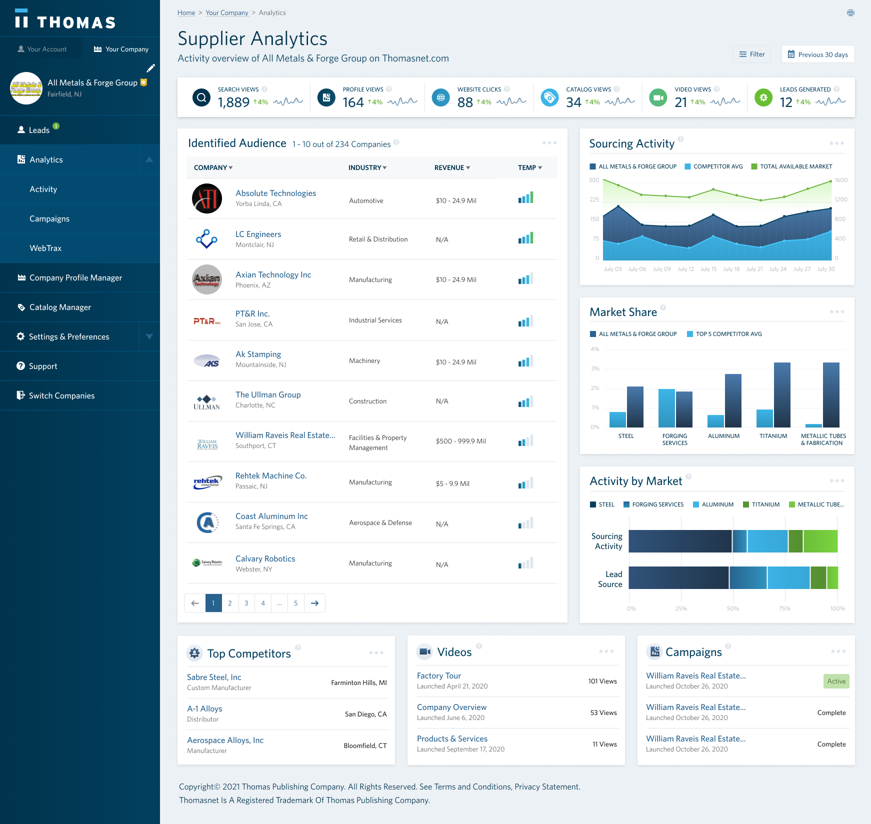
We wanted to create a color scheme that communicated a level of urgency and importance when layered on top of our branding. This would contribute to a higher response rate. To test this out, we chose a traditional cool-to-warm color scheme.
However, the orange and reds clashed with our brand’s green and cyan. While orange and red represented warm and hot, it was also the colors we used for platform warnings and errors.
With this in mind, we iterated towards a more cohesive visual design:
Initial High-Fidelity Dashboard UI
We ditched the orange and reds and instead doubled down on our brand colors to communicate the level of urgency and importance across components. We were confident with this decision since we already did this with our call-to-actions throughout the platform.
We introduced two stacked horizontal bar graphs in place of the pie chart in Activity by Market. Unrelated to my disdain for pie charts, this section needed to communicate two different data points (sessions and leads) for a better narrative without taking up additional screen real estate.
Concurrently, we were designing the company detail screen based on the decisions that we made on the dashboard:
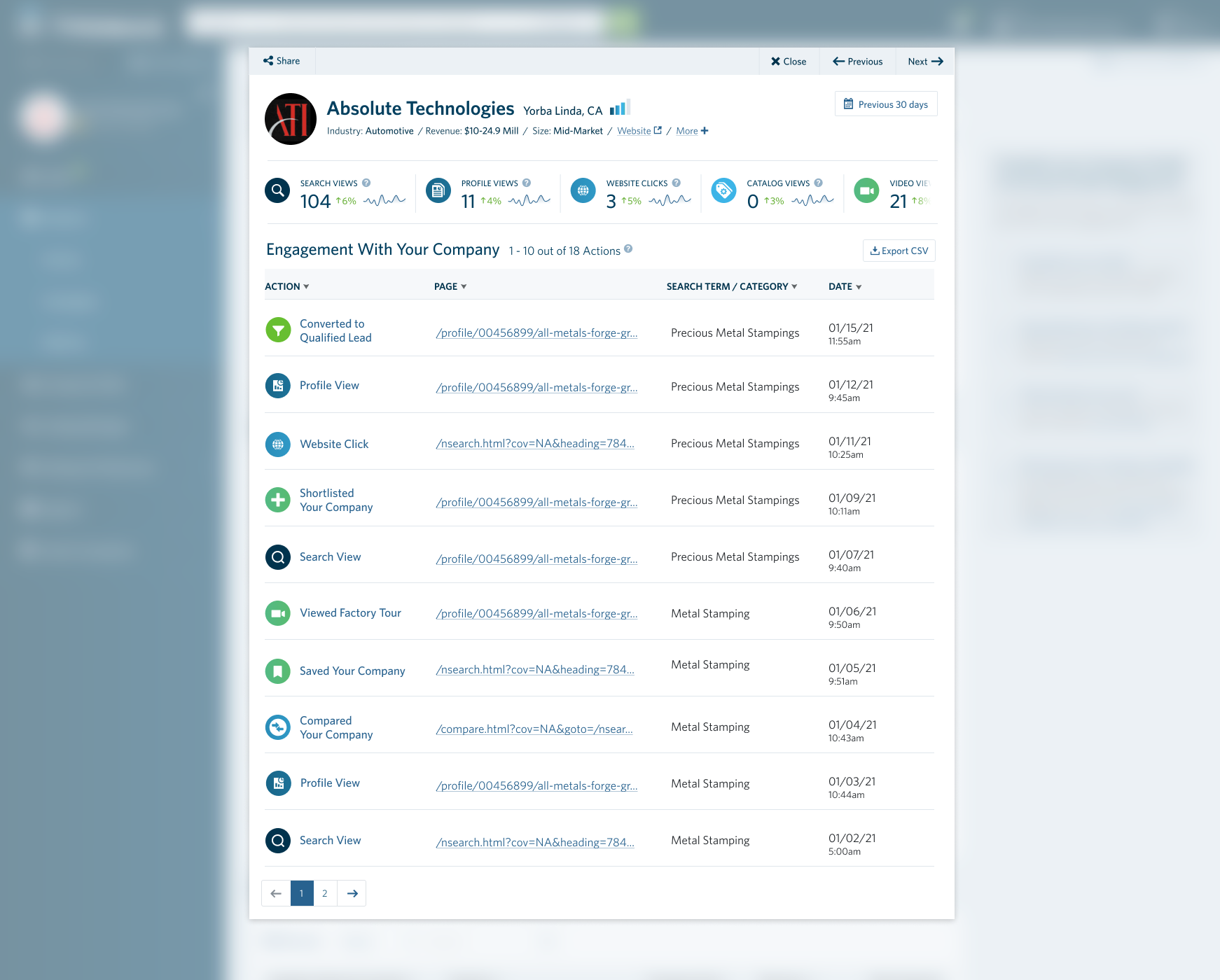
Company Detail UI
The purpose of this screen was to communicate the engagement details of this company with the user’s company (the supplier).
The experience consists of three primary components:
- The modal header which surfaces the respective company information as well as a date picker controls;
- The summary metrics of the interactions this company took with the user’s company;
- And a contextual timeline of the different interactions.
We decided on a modal approach since this would make it easier for the user to briefly switch between companies without leaving the dashboard — insight gathered from how users interact with companies in our search results.
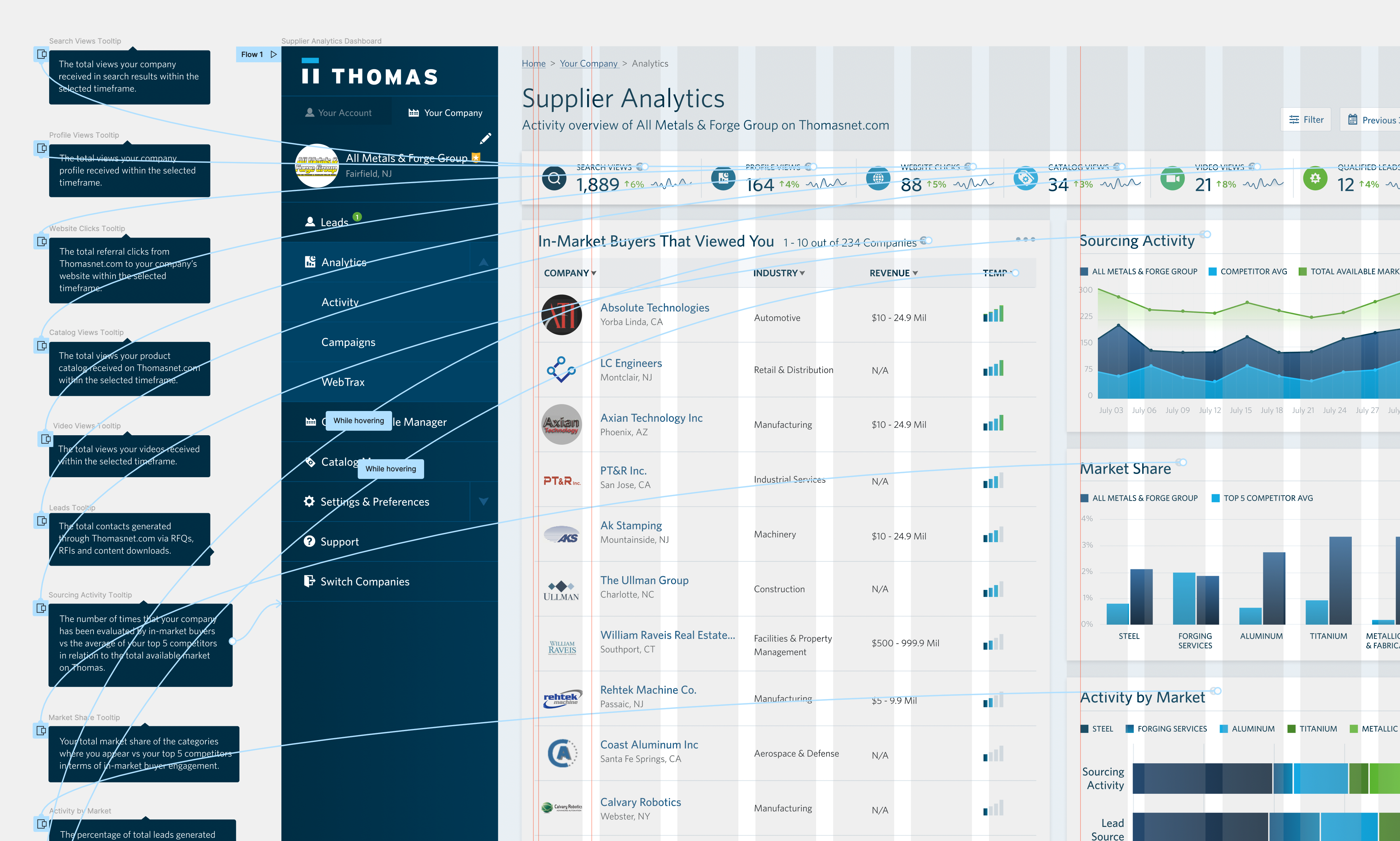
Prototype Tooltips
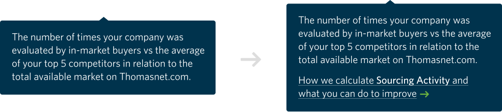
Since self-service and supplier autonomy was one of the key focuses of the dashboard, we provided contextual tooltips for every component on the dashboard and made this an integral part of the prototype.
User Testing the Proof of Concept
We now had a working prototype with the interactive key features ready to user test. There were two overarching questions that we needed to answer to inform the decision of when we could begin building the front-end:
- Is the design interpreted by users as intended according to the key objectives?
- What insights and gaps can we identify to iterate and improve on the current design?
With that in mind, we went to work with formulating a test plan and launching our initial test through Usertesting.com — a platform we leverage to automate, democratize, and include user research & testing in every phase of our design process.
First Round Sample of User Testing
After the initial round, users unanimously appreciated buyer information, interest/temperature gauge, & top competitor information. Oh, and they were digging the color scheme.
Marketers were explicitly interested in expanding summary metrics — something we hypothesized would be the case but decided against to avoid competing with Google and focus on the qualitative aspect.
Users on the sales side were specifically interested in prospect information and sales conversion data. A few claimed they would use this as a prospecting tool. A use case we initially didn’t plan for but seemed to fit with the overarching purpose.
Although users mentioned their appreciation for top competitor information, a few also noted how it would be helpful to understand how they compared vs. their top competitors. They asked for information we provided with the Market Share and Sourcing Activity graphs — it just wasn’t clear to them.
With this in mind, we iterated:
Iterations after Initial User Test
To better communicate to users the purpose of the right-hand graphs, we updated the titles to be more contextually relevant and introduced subtext to highlight the top competitor aspect.
For a few users, the Identified Audience wasn’t resonating; this led us to optimize the title. We needed the labels of these components to be bullet-proof.
We also focused on increasing the visibility of the help icons across the board by changing the color value from $light-gray to $gray.
We tested again:
Second Round Sample of User Testing
After the second round of tests, users consistently understood the graphs and found the intended value. Seems like we hit the mark.
Designing the Complete Experience
We now had a proof of concept that was inline with product strategy, validated by users, and supported by stakeholders and leadership. Our next steps were to design the full experience while we simultaneously built the front-end, stayed true to our original objectives, and learned from users along the way.
The Upsell Experience
After the last round of user tests, we were now receiving more focused feedback by users on wanting to know how to improve these metrics. A recommendation engine would be the ideal solution, but considering our current resources and timeline, this wasn’t viable.
Tooltips & Empty States
Instead, we layered on the current experience paths for deeper information and ways to increase the respective metric. We worked with marketing to create help center content that included information with a path to upsell.
Included upsell paths within tooltips
But we didn’t stop there, we used this insight to inform the approach we took towards empty states. Every component was now equiped with an upsell-focused empty state.
Created upsell-focused empty states
Non-Premium Supplier Experience
Before we went all in with building the front-end, we needed to figure out what the experience would be for non-premium suppliers.
It was critical for us to create a shared understanding of the minimum viable vision to build the front-end with this in mind and save the team weeks of feature development in the near future.
The minimum viable vision was key because the concept of having non-premium suppliers wouldn’t be a reality until the fast follow feature of automating the company claiming and upsell process by Q2 of 2022.
With the constraints in mind, we put together the following:
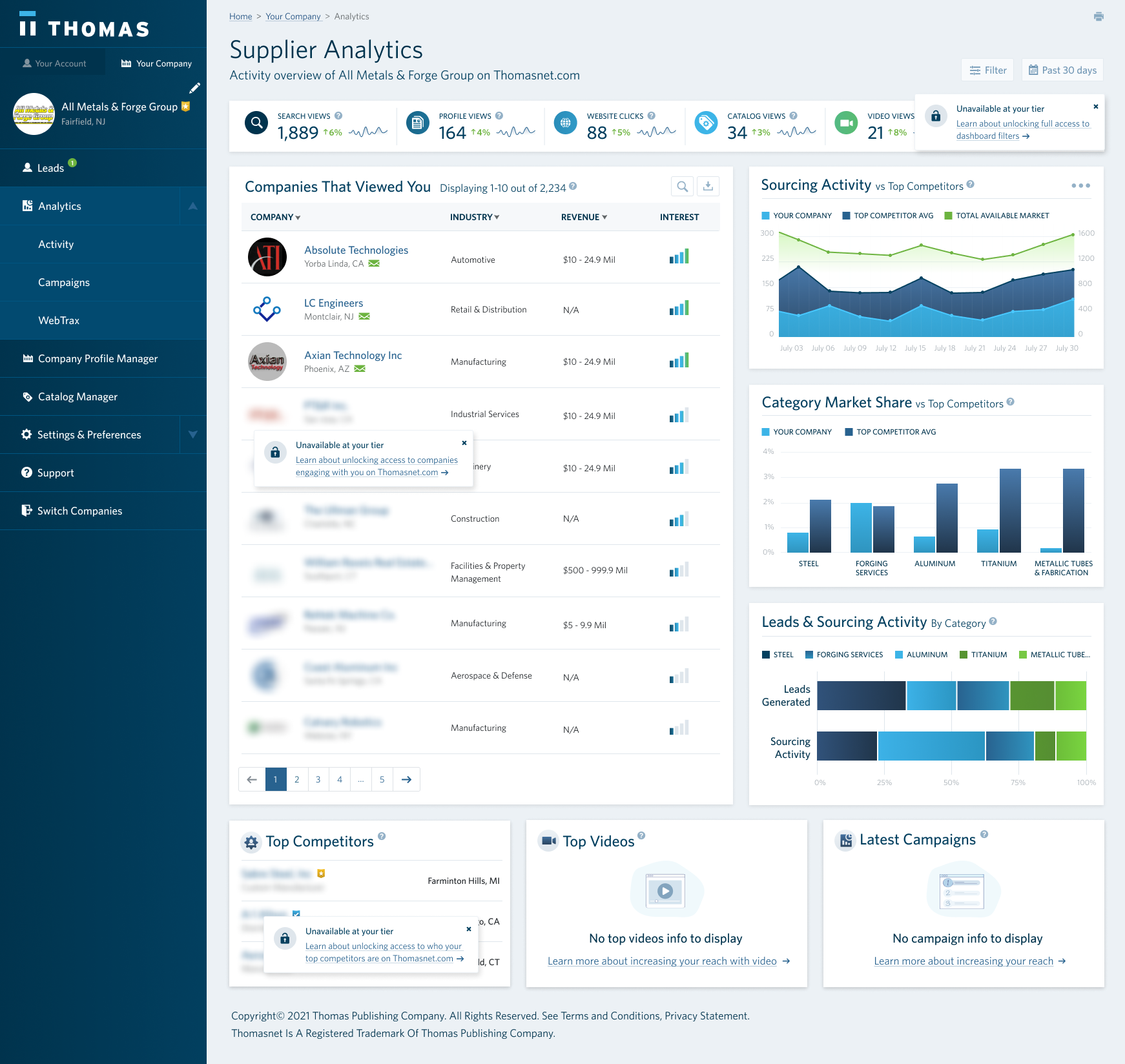
Designed a limited experience for free subscribers
We limited the use of filters and date picker, giving non-premium suppliers the default state of the dashboard. We also provided a limited view of the companies that engaged with their content — only providing full information for companies that had contacted them. And last, we blurred the company name of their top competitors.
All interactions with disabled or blurred components prompted a popover with a custom upsell message letting the user know how to enable.
The Self-Serve Experience
To lower the human dependency, we needed to give users more control over the data we presented on the dashboard.
Marketing users wanted a better understanding of conversion rates by custom segments within specific time periods. Sales users were mostly interested in narrowing down the list of interested companies by firmographic attributes.
The objective was to design a baseline experience we can learn from to avoid building a robust set of features users wouldn’t engage with.
Dashboard Filters
We focused on four main filters based on historical data and surveys for attributes suppliers cared most about. The filters took place at a page level with some components having their own localized filters (e.g., search in identified audience).
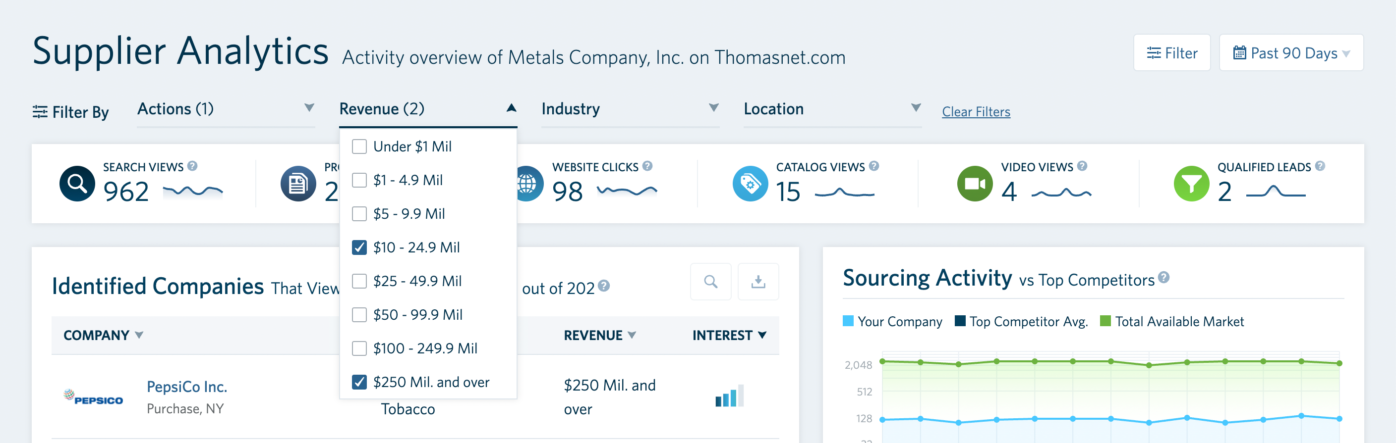
Dashboard Filters
Date Picker
The date picker was set to a default 90 days and allowed users to switch between preselected time periods or custom. We initially set the default to 30 days but based on user feedback and working with real data we changed the default to 90 days. This helped us show a more complete picture for an companies with long buy cycles (most suppliers).
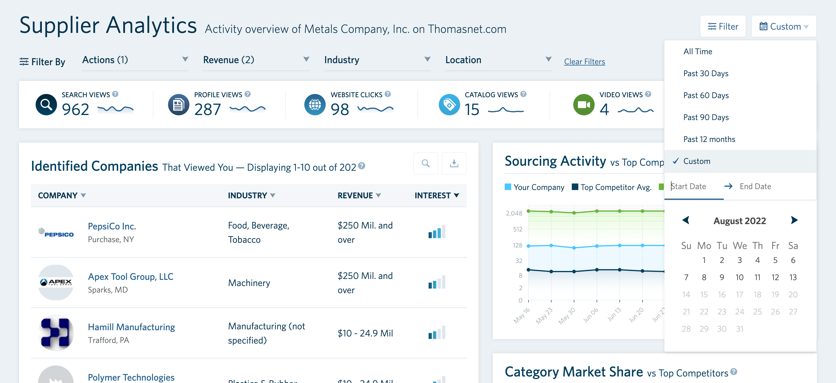
Date Picker
Category Engagement Details
And finally, we surfaced information on how the respective supplier was performing in specific categories. An understanding of the search views they received, click through rates to their company’s profile or website, and how many points they had allocated to the specific category (part of our revenue model) was the icing on the cake to provide a full self-serve reporting experience.
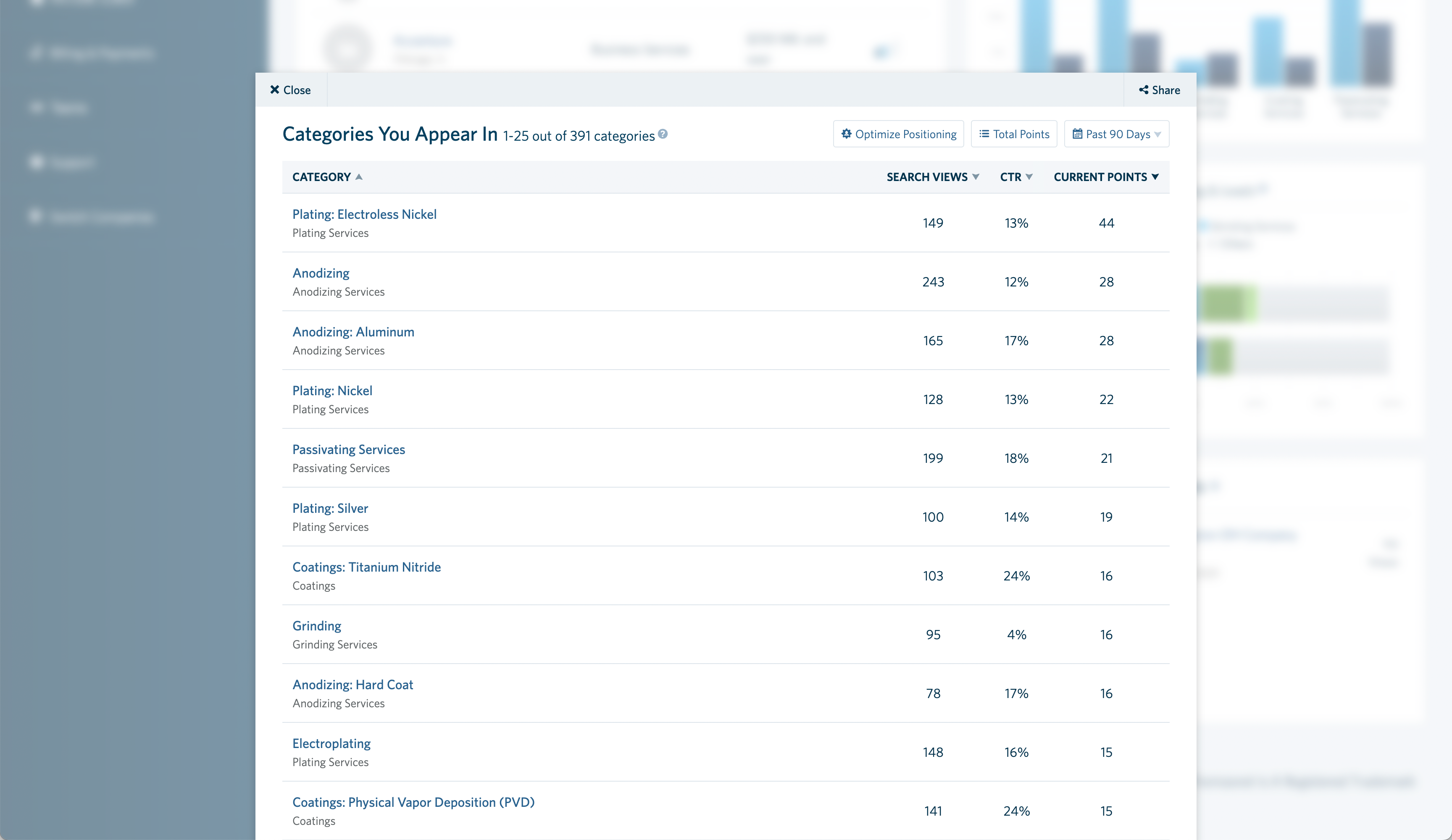
Category Engagement Details
The Reality of Building the Dashboard
Up to this point, most of the work was done via Figma. Not only were we facing the reality of coding what we designed, but every aspect of the dashboard depended on the reality of the data we were working with.
Although we used real data since the initial wireframes, we were still going into the next stage ready for what VSCode decided to throw at us.
We also wanted to improve the dashboard’s resiliency by testing every step of the way with real users, real code, and real-time data in uncontrolled environments using a multitude of browsers and devices.
I’m in the process of putting together this part of the case study. Stay tuned!