
Table of Contents
Unless you’re off on a remote island and you’ve dismissed all technology from your life (props for somehow making your way here), I’m sure that by now you’ve heard of the upcoming iPhone X and it’s edge-to-edge display. In their effort to make a true all-screen phone, Apple introduced a “notch” that takes up part of the screen, encapsulating the front camera and additional sensors.
Pretty interesting from a design standpoint, but I’ll cut to the chase: This directly affects how our websites get formatted on these devices — it’s a pretty big deal.
(Related: Static Websites + JAMstack = <3)
You can see Safari adds default margins in order to buffer the safe areas of the notch.
So for those who craft the web, we could choose to continue designing as is and let the browsers make design decisions for us. Or we could come to terms with reality, accept the next generation of device screens, and take full control of our designs. (What do you think I’m advocating for?)
Regardless of our opinions of Apple’s approach, the fact is that at the time of writing this post, Safari takes up 51.24% of the mobile market share here in the United States, and 17.74% world wide — a ton of people are going to be viewing our websites through these displays.
No need for a complete overhaul of your existing code base, though. You can embrace the notch with two simple code changes.
Remove default margins with viewport-fit=cover
Based on the CSS Round Display Spec, we’re able to get websites to take up the entire screen by adding viewport-fit=cover to the viewport meta tag in the <head>. Here’s what mine looks like:
<meta name="viewport" content="width=device-width, initial-scale=1, viewport-fit=cover">
This descriptor, viewport-fit, accepts two other values: auto, the default behavior, and contain which, according to the CSS Working Group, is when “the initial layout viewport and the visual viewport are set to the largest rectangle which is inscribed in the display of the device.” I’m not entirely sure what that means, but in this case it seems to have the same result as default.
Getting back on track here… Now our website covers (get it?) the screen in its entirety. We now have make sure that the notch doesn’t interfere with any elements on the website — remember, those default margins were there for a reason.
Avoiding Safe Areas with constant()
Apple introduced constant(safe-area-inset-*), which resolves to the dimensions needed by the user agent or browser to avoid the notch and other safe areas of the phone.
.inner-wrap {
  padding:2.5em constant(safe-area-inset-right) 2.5em constant(safe-area-inset-left);
}
Our content is now respecting the safe areas defined by the UA.

At first, I wanted to bypass constant() and just use good ol’ ems/rems. The problem is that the dimensions of these safe areas will most likely change when other devices introduce safe areas and future versions of the iPhone are released. Avoiding constant() would be the equivalent of designing fixed-width mobile websites to only fit the iPhone.
Even if you were to take this approach today, the dimensions of the safe areas change when you go from landscape to portrait.
Fallback for constant()
Browsers that don’t support constant() will display a value of 0 (that’s pretty much every browser except Safari at the time of writing this post). The following does the trick for me:
.inner-wrap {
  padding:2.5em 1.5em 2.5em 1.5em;
  padding:2.5em constant(safe-area-inset-right) 2.5em constant(safe-area-inset-left);
}
Dimensions in Pixels
I was able to get a list of dimensions from the iPhone X Simulator in Xcode, and now, I’m sharing it with you.
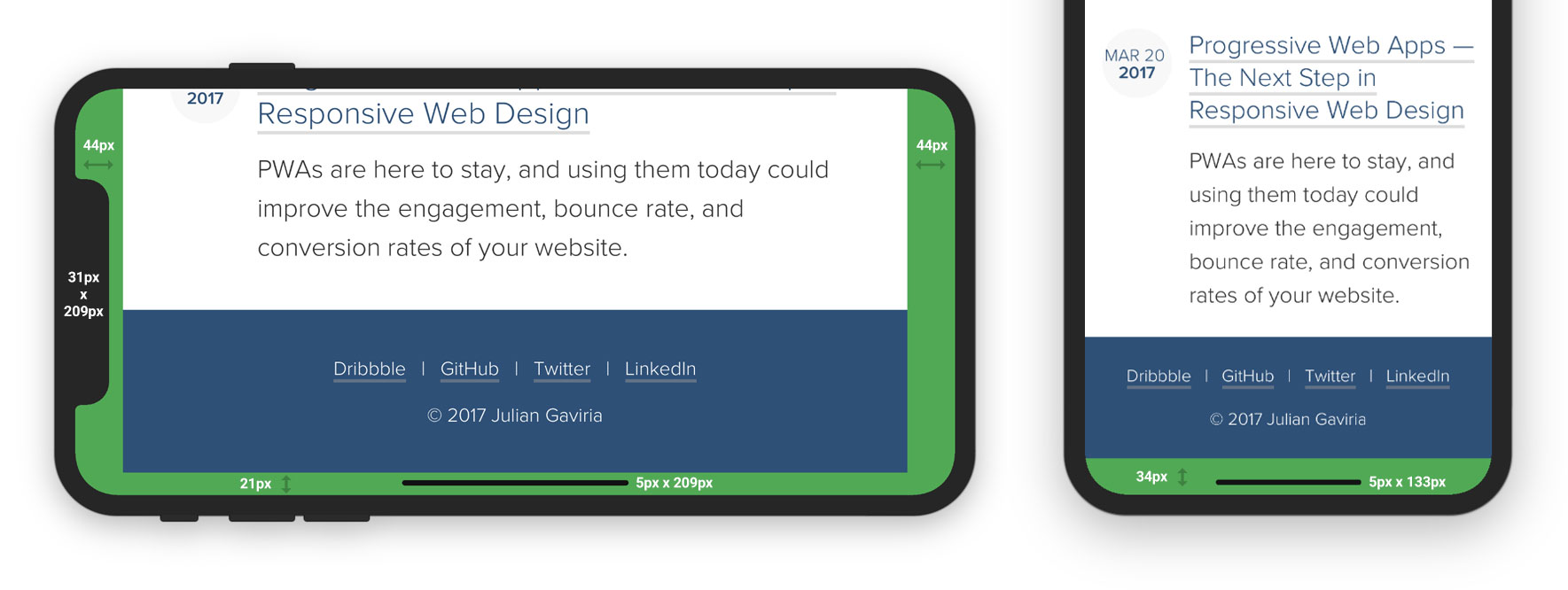
Elements
| Element | Landscape | Portrait |
|---|---|---|
| Notch | 31x209 | 31x209 |
| Home Screen Indicator | 5x209 | 5x133 |
Safe Areas
| Area | Landscape | Portrait |
|---|---|---|
| constant(safe-area-inset-top) | 0 | 0 |
| constant(safe-area-inset-right) | 44px | 0 |
| constant(safe-area-inset-bottom) | 21px | 34px |
| constant(safe-area-inset-left) | 44px | 0 |
Closing Thoughts
Were the design decisions made by Apple the correct ones? Maybe. Will this change the way we build websites? Yes, but so did responsive web design back in 2011 and Progressive Web Apps within the last year at a much larger scale. The reality of it is that we’re part of an unpredictable industry; learning and adopting are the two habits that keep us afloat.
Let’s take this change with a grain of salt and prep for what the future of mobile devices may have in store.
Resources
- Designing Websites for iPhone X - The original article published by WebKit that drove everyone nuts
- Removing the White Bars in Safari on iPhone X - Well put together article on removing the margins in the iPhone X
- “The Notch” and CSS - Chris Coyier’s take on the issue
- New WebKit Features in Safari 11 - Self-explanatory

I'm Julian, a product design leader and developer with a habit for experimenting (I did some cool stuff at Thomasnet.com). I mostly write about what I'm working on related to product design, front-end development, and experimentation.
While you're here, I'm currently in the market for a design leadership gig. If you're interested in working together, hit me up, or feel free to share my resume.
Notes From the Field

Designing Multi-Sided Platforms
A comprehensive guide on designing the experience and growing the engagement of networked markets.

A Pragmatic Approach to Design Principles
How we took our design culture from executive-centric to user-centric with the help of pragmatic design principles.

Server-Side Split Testing for Static Websites
When to use, when to avoid, and setting up your A/B testing stack.

How We Adopted CSS Grid at Scale
From team buy-in to fallbacks, here's the approach we took at Thomas with the implementation of CSS Grid.

Don't Fight The Notch — Designing for the iPhone X
Coming to terms with the notch on the iPhone X and its effect on mobile design.

Lessons Learned After Running 300 A/B Tests on 20 Different Websites
Over the past 2 years I’ve dedicated part of my career to building a conversion rate optimization (CRO) team from the ground up. Here's what I've learned.